I had always been hiding behind papers containing my speech and my slides. This did not go away until my wonderful teacher introduced me to Toastmaster. I joined Toastmaster International before I enter NUS and obtained the Certified Toastmaster certification on completion of 10 speeches with different objectives. It helped me tremendously in gaining confidence to speak in front of unfamiliar crowd. After the completion of 10 speeches, I have gone through some training on various topics like, how to tell a story, eye-contacts and gesture, vocal varieties, getting comfortable with visual-aid, giving a persuasion speech and inspirational speech, etc. If you would like to be able to speak without the fear, Toastmaster is definitely a good way to start.
Sorry for side-tracking but public speaking and slides are always relevant to each other with emphasis on the way you present more than slides, so I felt that it is important for me to mention some ways that might help improve the public speaking skills as well.
Back to slides now. I still remember it was my first Keynote after being introduced to the world of Apple. I was amazed by the slides and presentation by Steve Jobs. Instantaneously, I decided that that's the style of presentation slides I want. I was lucky to be acquainted to the Keynote.app from iWork. It produces elegant and minimalist presentation slides with little effort. So long hideous and wordy slides. Hello classy slides. However, it wasn't without its own problem. I overused too many fanciful effects that come with the software. All this was just the beginning when I explored deeper into slides creation. Now, I realized that it is not the app that you use that matters. But it's the content and your presentation skills. So, whatever that I will be sharing with you, applies to Powerpoint.app as well.
Below are 5 important points to remember when creating a deck of slides. The 5 points listed below are by no means exhaustive as there are more to be noted. It is important to remember, the presentation matters more than your slides. Slides are just visual-aid after all. The spotlight is still on you and what you are presenting.
Here are the 5 points.
1. Tell a story
It is only with a story that you are able to get conviction from your audience. I am sure all of us prefer a story than listening to a dry stating of fact. With a story, you are able to bring your audience through the ups and downs of the subject that you are presenting. This can be useful for case studies, business plan, business idea generation, etc type of presentation. Of course, if the module requires you to present an answer to the tutorial question with a step-by-step solution, the story approach won't work. Anyway, try to make sure that you are telling a story whenever you can do so. But remember, every presentation have different requirements and approach, so these are not dead rules to follow. A good example in telling a powerful story can be seen in Obama's victory speech when he narrates the Change witnessed by the oldest voter of US to bring across his Change message. Do watch it if you haven't [click to watch]. It is too good to be missed.
2. Avoid bullet-point
This is definitely something important to eliminate. Really, there is no point cramming every single line of what you want to present into a slide and read from there. The audience might as well read it themselves rather than listening to you. Guy Kawasaki in his Art of the Start speech [watch here] said that, if you cram everything inside a slide, you do not know your material well. When you do not know your material well, you will start reading your slides. Your audience will then quickly figure out that you are a Bozo that does not know your material. They will then read ahead as they can read faster than you speak. So definitely avoid being THE Bozo. Have only a one liner in your slide if you can. Convey one message per slide to make sure that it sticks in your audience. Your slides should not be useful unless you are there to present the presentation. If your audience need additional information, provide them with supplementary notes AFTER your presentation. You won't want them to be busy reading your notes instead of listening to you right?
3. A Picture Speaks a Thousand Words
There are actually various methods of making a powerful presentation slides, but the picture way is what I feel effective personally. I am a very visual person, so pictures leave better impression on me as compared to word. I realized that in Steve Jobs's keynote, he always has powerful images and photos to help him illustrate his product feature. Image allows you to relate the point that you are conveying much easier. However, avoid cheesy clip-art that comes with your Microsoft Office. Those are too old school. You don't need a black stick man pondering with question mark in all your slides that you want the audience to think about the point that you brought up. Use high quality photos instead. You may find such photos from website that sells stock photos or provide stock photos for free. Flickr's photos shared under the Creative Commons License[http://www.flickr.com/creativecommons/] are one good source for high quality photos. Try to find one with enough space for you to fit in your words. Just to give you an idea, a sample are attached below. It's one of my latest work done for a poster of a de-stress event for my residence. The idea behind are adopted from how I create my slides.

4. Make numbers (data) meaningful
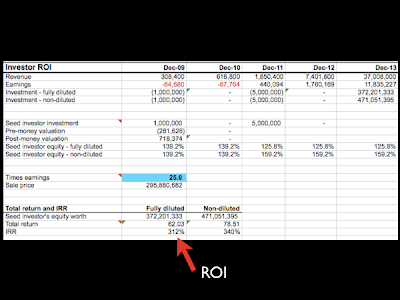
I learn this very recently during one of the presentation slides I did for the Start-up Singapore competition. A lot of times we are overwhelmed by slides with big tables containing hundreds of different numbers with the presenter flying their little red laser dot around trying to make us look totally dumb when we don't get them. Another overkill stuff is graphs of survey results. I see this a lot during one of the recent presentation. No one needs to know every single result you obtained from the survey. Giving the audience bars and bars of graphs don't really help them in making sense of what kind of trend that you want to show. Numbers that you obtained be it from the survey or your ROI for your business idea will only make sense if you make them meaningful. How to make them meaningful you may ask. Let me give the first step to you. It's a no-brainer and a giveaway really. Come closer...
.
.
.
It's just as simple as...
.
.
.
MAKE 'EM BIG!
Yes, use BIG HUGE font size for that specific number that you want to highlight. Don't hide them somewhere in the bottom right of the table with the rest of the unimportant figures. Make it so big that it covers half of the screen even. This will lock the figure in the audience. They will be able to remember that slide with that BIG FAT YUMMY number which maybe your profit in 5 years or the 1000 users that say "Yes, I am interested in buying your product".
Check the following slides and compare yourself. You will know that I am not kidding you when I say make the number big.

VS.

Which one is more powerful? You should know the answer by now. Don't feel compelled to take a screenshot of the table just to prove that you got the figure from the spreadsheet. Just be ready to answer how you derive that if the audience would like to know.
Other ways of making numbers meaningful are making graphs that highlights the important figures or just simple table for comparison. If it is possible to break down the number into smaller more understandable number, please go ahead and break them down. Another sample to illustrate this.

It might not come across strong to the audience if we just state how many millions or billions of members Facebook has. It's hard to make sense of large figures. But by putting them into a context that they can understand or make sense better, it makes it easier to make an impact on the audience when showing important trends especially.
5. Keep things simple
Dump that theme from the powerpoint template, it's getting stale when everyone else is using the same theme. Also, using the same theme as your lecturer's slide is really not cool. Stay with plain background. At most, a little gradient.
Use at most 2-3 transition if you have to. No one likes overloaded transition presentation. It's as annoying as fly flying on top of your head. It will be distracting if you have too many fanciful transition (Note to self : Lesson well-learned.). Same goes to build within a slide. Use subtle transition like "dissolve" instead if you really have to build the content in your slide.
Other thing to trim away from your slide is cheesy sound effect like the "swoosh" or the "clap" when you end your presentation. Your audience will clap for you if you have done a good job in presenting, there is no need for you to clap for yourself.
So to summarize, the simpler your deck of slides is, the easier it is for you to convey your message. After all, presentation is to present the message or the idea behind and not to copy and paste what you have written in your report. Also, I cannot stop stressing that it is the content and how you present it that matters. Slides are just visual-aid to help you better illustrate your message.
I hope that this post have been useful for you. I am still in the process of learning and perfecting my skills myself, so I dare not call myself the expert in this. I just hope to share with all of you what I have learned, so that we can all progress together. Try to Google for more resources if you are interested in learning more (I am well aware that all SOC students already know this, but just in case =) ).
Time to get some sleep after posting such a long post. Till then, see you in my next post.


No comments:
Post a Comment